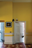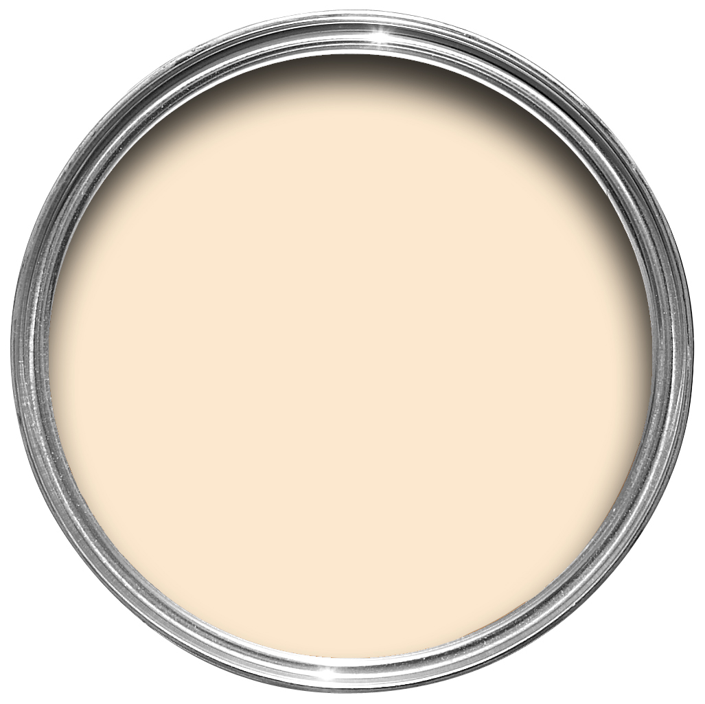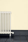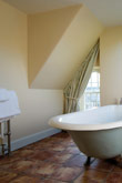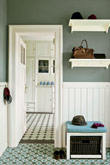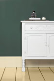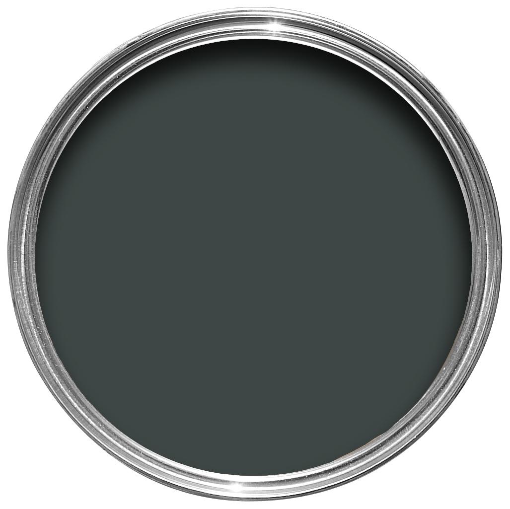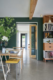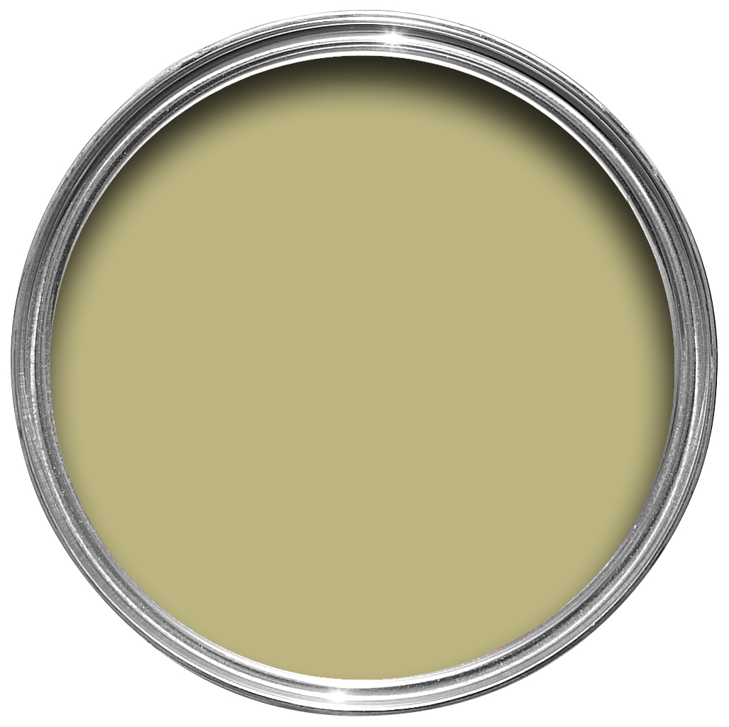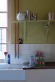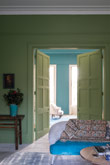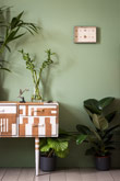
Farrow and Ball Paint Colours
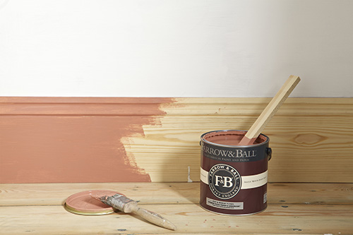
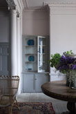
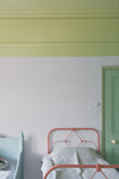
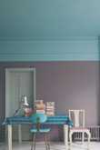
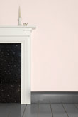
Farrow & Ball are dedicated to creating unmatched paint and wallpaper using only the finest quality ingredients and high levels of rich
pigments. From subtle neutrals and muted pastels, to lively accents and rich dark hues, the 132 colours work beautifully both alone and as part of a scheme. Paint colours are available in a range of durable interior and exterior paint finishes. Contact us to find out more.
New Colours
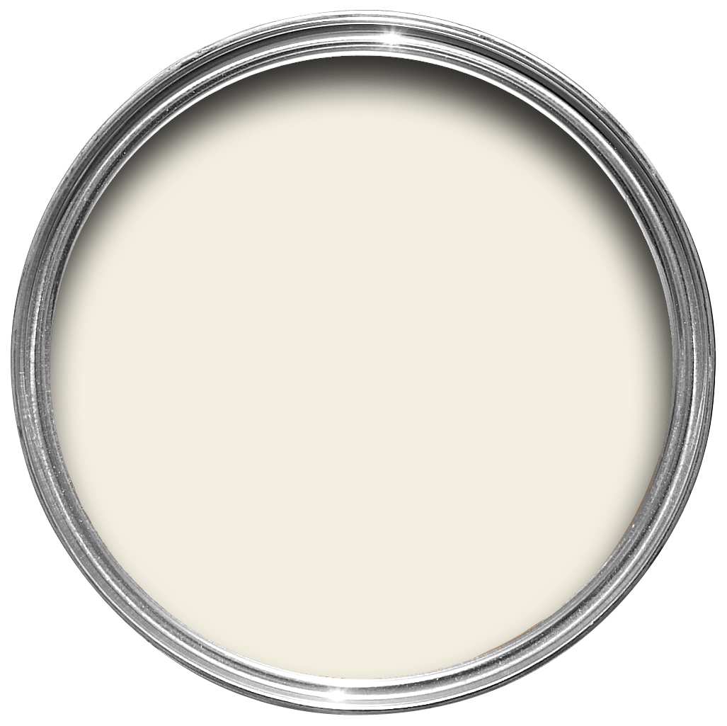
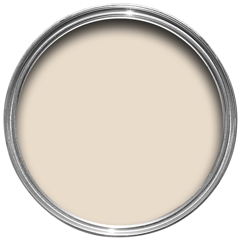
School House White
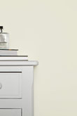
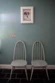
A soft off white
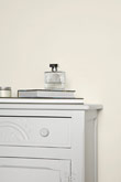
This is the lightest colour in the group including Shadow White, Shaded White and Drop Cloth – each created to look like white when used in deep shade. Pared back, timeless and familiar without the cool undertones of the more contemporary neutral groups, this soft off white is reminiscent of the colour used in old school houses.
Treron
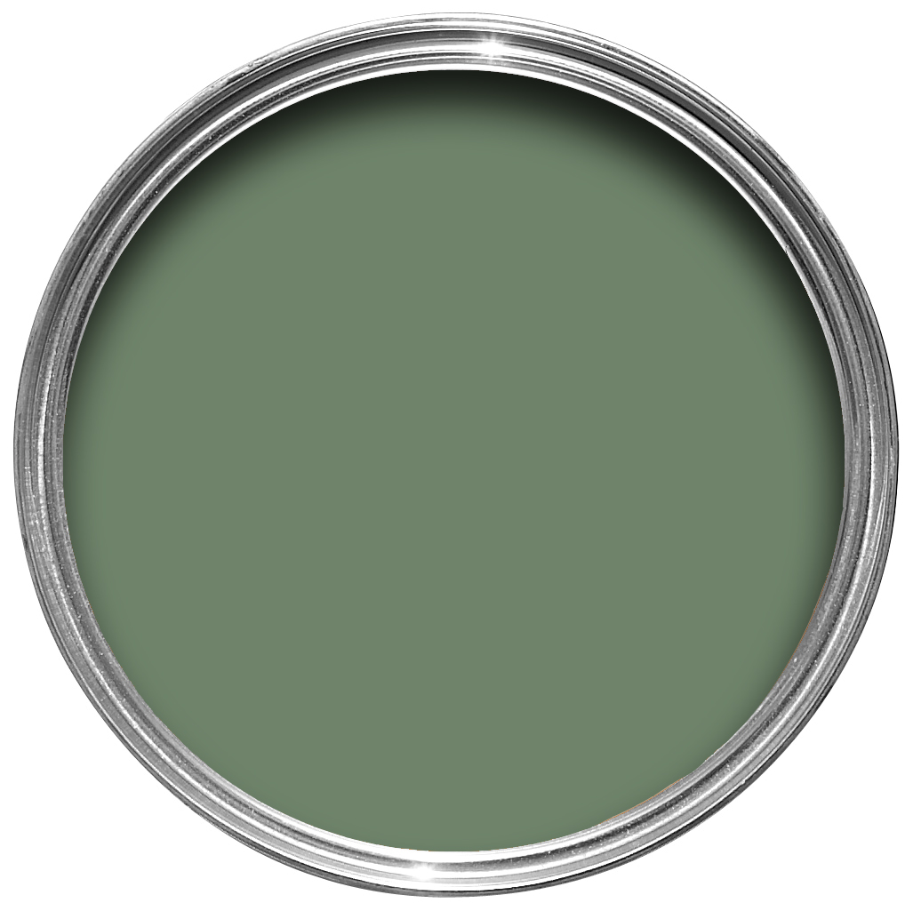
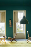
A dark grey green
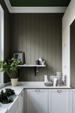
This enduring colour is a dark green version of Farrow & Ball classic Pigeon, hence being named after the green variety of the same species. Although traditional in feel, Treron is perfect for modern homes where lots of natural materials are used or as an accent for both French Gray and our Traditional Neutrals.
Jitney
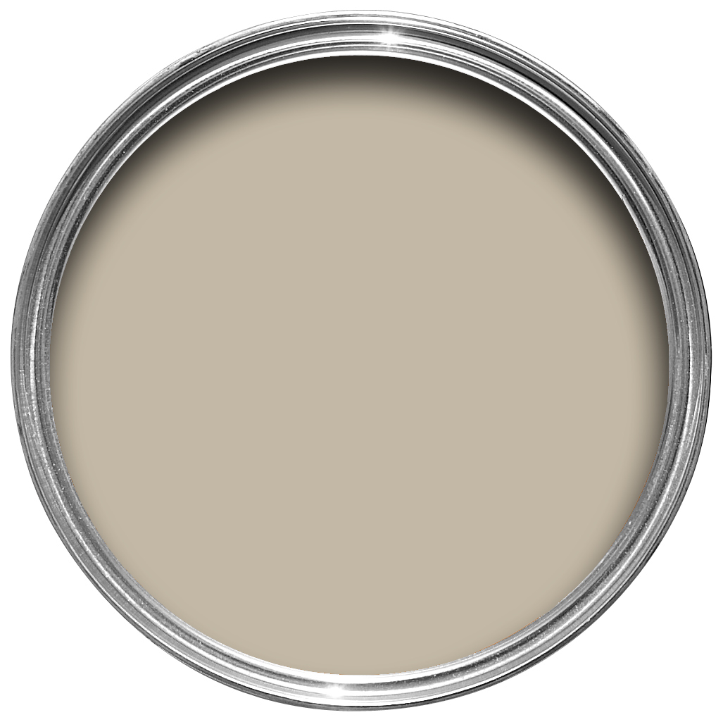
A relaxed brown based neutral
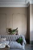
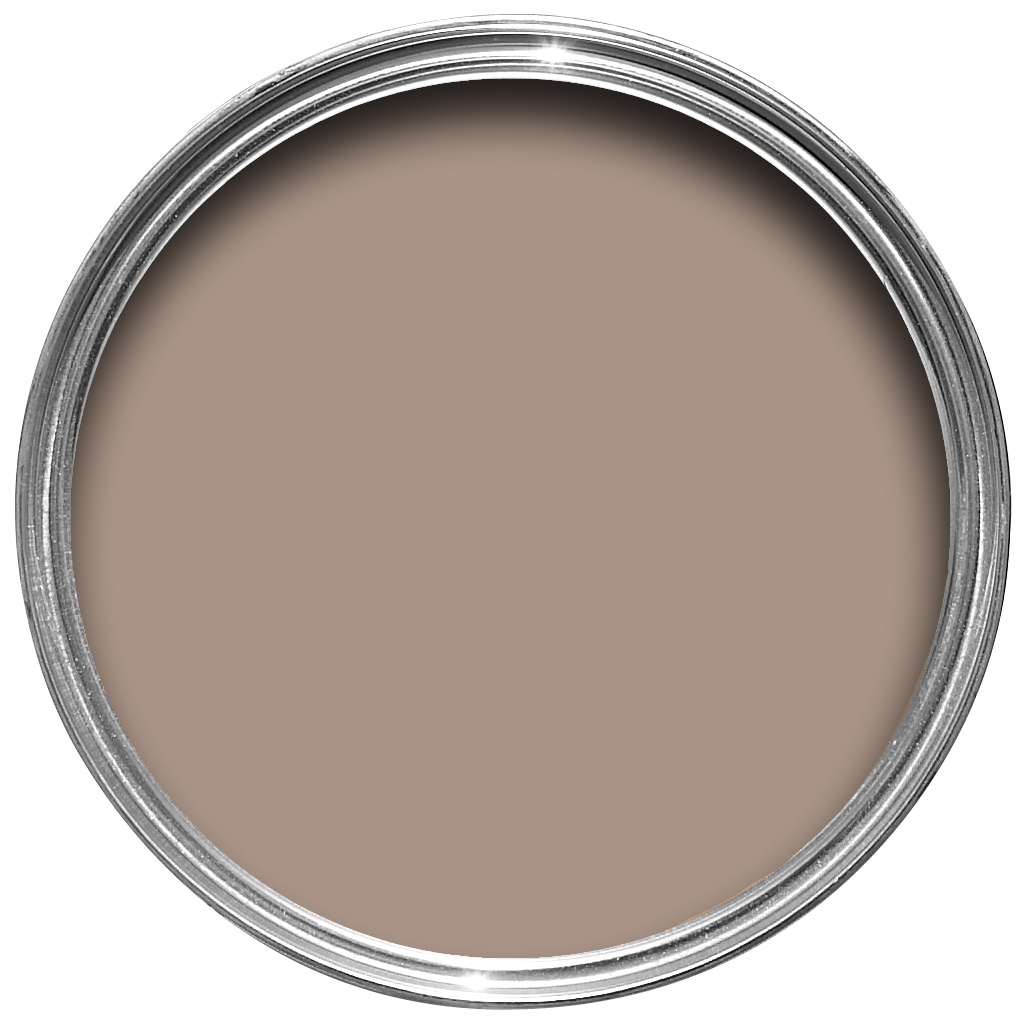
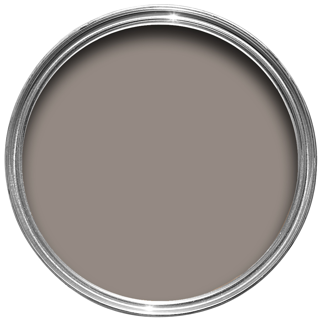
This earthy colour sits somewhere between the more traditional Oxford Stone and greyer Elephant’s Breath. Though muted, it is incredibly uplifting and reminds us of lazy days by the sea – hence sharing its name with the bus that whisks New Yorkers out of the hot city to the similarly coloured sandy beaches of the Hamptons.
Paean Black
A chic red based black
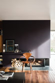
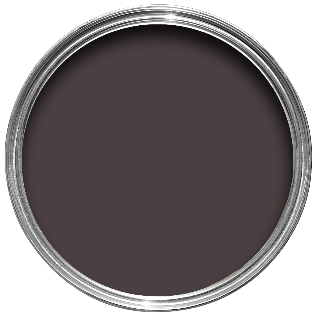
This Georgian inspired red based black creates an intimate feel in super contemporary or bohemian homes, while adding a distinguished look to traditional exteriors. The perfect accent for all our reds and completing our range of blacks, Paean Black conjures up the shade of old leather hymnals and so is named after a song of praise.
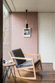
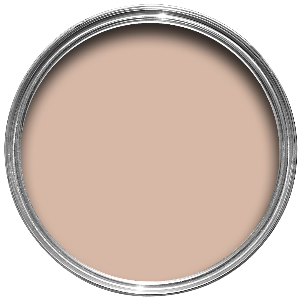
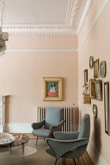
Sulking Room Pink
A romantic and muted rose
Not to be seen as overtly pink, but rather a muted rose with enormous warmth, its powdery feel makes it incredibly soft and easy to use with complementary tones. Sulking Room Pink is evocative of the colours so often used in boudoirs, a room named after the French ‘bouder’ – to sulk.
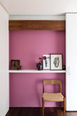
Rangwali
An exotic and adventurous pink
This colour is exotic, happy and vital. The most adventurous of our pinks, Rangwali is incredibly friendly and takes its name from the powder which is thrown so enthusiastically during the Holi festival of colours in India. Though bright, it has an absorbing depth of colour which is achieved by adding a small dose of black pigment.
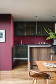
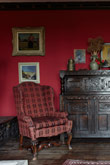
Preference Red
A deep, rich red
The deepest and richest of our reds, this Baroque colour is named in honour of our original trade name, Preference Paints. It can be used with any of the Red Based Neutrals but is particularly striking when seen in combination with Paean Black and Sulking Room Pink. The preferred red of modern homes!
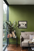
Bancha
A protective olive green
This mid-century modern green is a darker version of the much loved archive colour, Olive. Perfect for those who want to embrace stronger colour in the home, its sober tone creates rooms that feel calm and serene – especially when combined with soft pinks and browns. Named after Japanese tea leaves, Bancha, like a cup of green tea, provides a feeling of security.
De Nimes
A down to earth and grounding blue
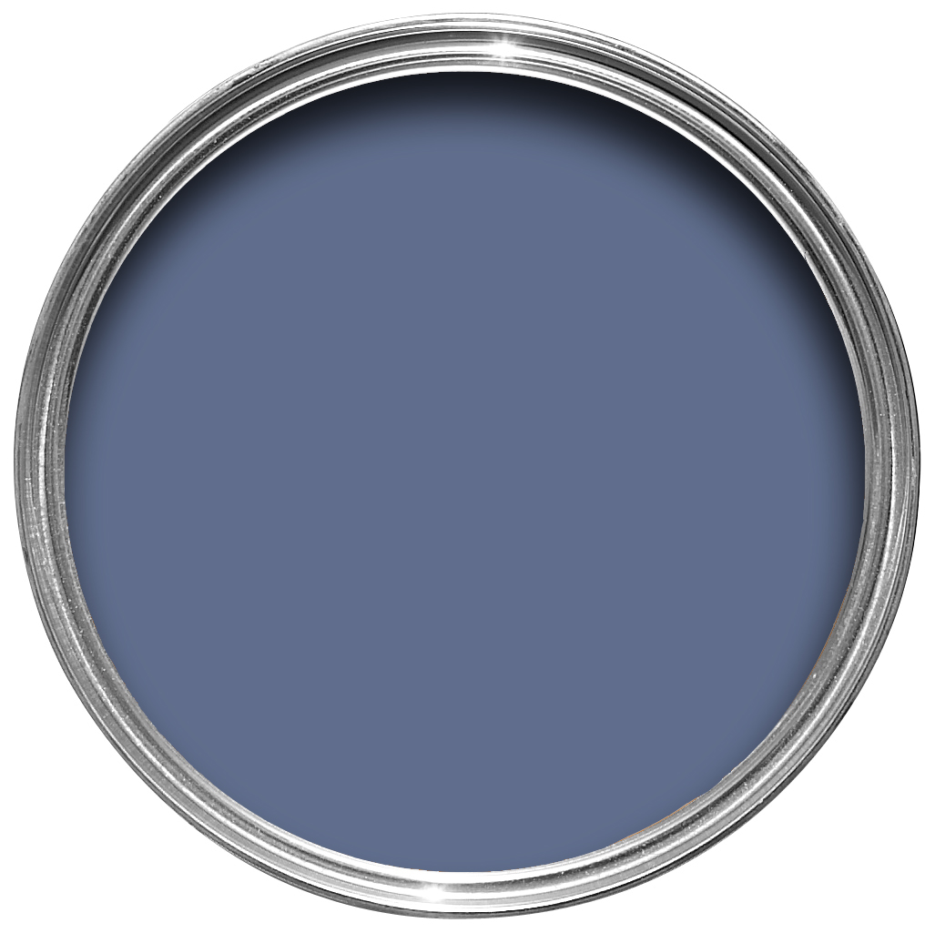
This quietly elegant blue feels wonderfully down to earth, so could be used on anything from a kitchen island to an airy drawing room. The exact shade is rooted in a regency palette but is inspired by the cloth of everyday workwear made in the French city Nîmes. Like denim, its blue hue is ultimately fashionable and yet always feels grounded.
All White
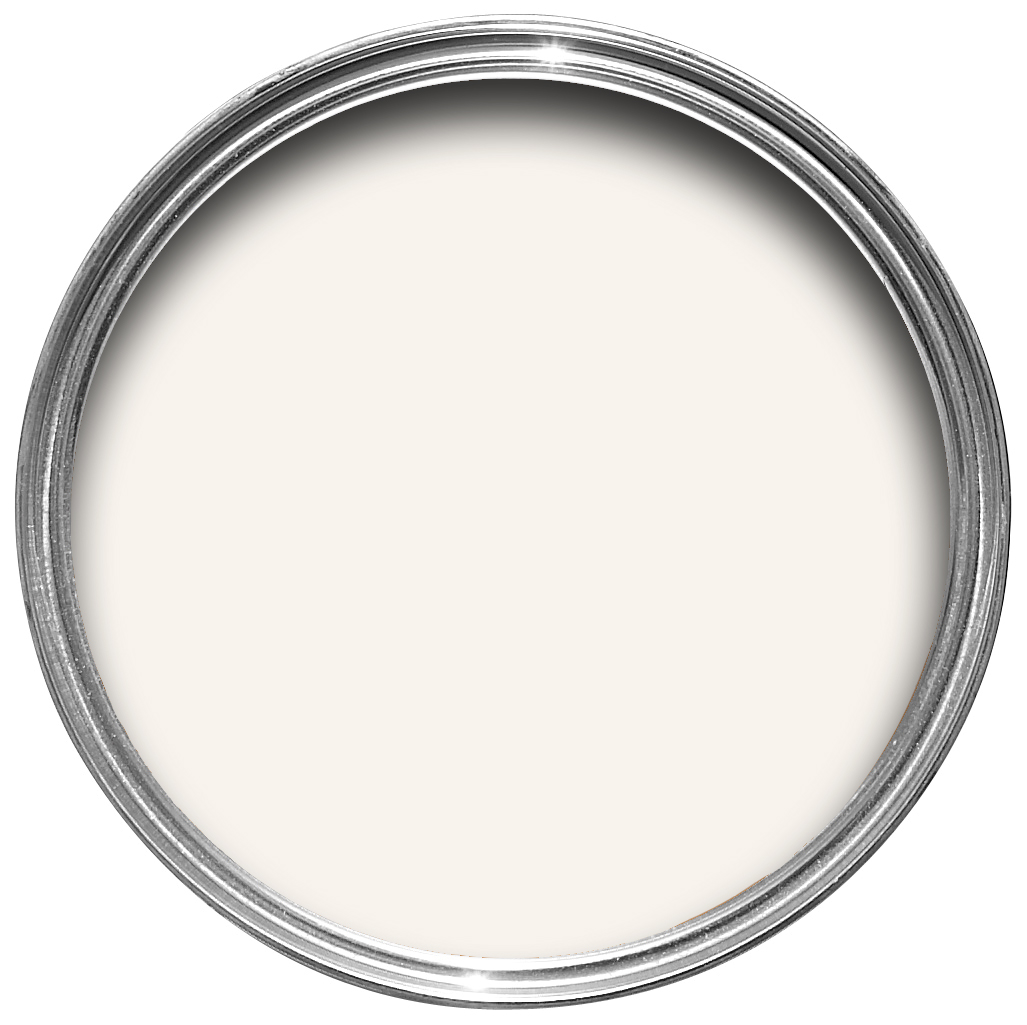
A totally pure white
All White is exactly what it says! Unusually, it contains no other pigment except for white, creating the softest most sympathetic colour without the colder blue undertones of a brilliant white. One of our Contemporary Neutrals, All White pairs seamlessly with Skimming Stone and Strong White for a warm scheme with a slight edge. For a clean and almost graphic finish, contrast with fresh, strong tones like Pitch Black and St Giles Blue.
Recommended Primer & Undercoat: White & Light Tones
Complementary white: Strong White
Wevet
A delicate white with a hint of grey
This delicate white has a barely there and almost translucent feel to it, and so shares its name with the old Dorset term for a spider’s web. One of our Easy Neutrals, Wevet is clean, understated and incredibly easy to live with. With its hint of grey, this hushed tone can be used as a wall colour for a neutral contemporary space or on ceilings and woodwork when combined with cooler greys.
Recommended Primer & Undercoat: White & Light Tones
Complementary white: All White
Wimborne White
Just off white
This just off white is named after the market town of Wimborne in Dorset and home to Farrow & Ball. Only a shade away from a pure white, the addition of the smallest amount of warm yellow pigment creates a very versatile shade which is just a little softer than All White.
Recommended Primer & Undercoat: White & Light Tones
Complementary white: All White
Pointing
A warm and delicate white
This fresh and uncomplicated white is named after the colour of lime pointing used in traditional brickwork. One of our Red Based Neutrals, Pointing has a warm undertone to it which creates the prettiest of spaces when used on walls and always softens the feel of a room alongside strong, traditional colours.
Recommended Primer & Undercoat: White & Light Tones
Complementary white: Wimborne White
James White
An off white with a slight green hue
This off white was first created for the pretty garden room of a discerning Dr James with a fresh underlying green tone. The slightest hint of green creates a calm, soothing and airy feel which is particularly useful for darker interiors. When used with no contrasts, James White transforms the space into the most light and tranquil of rooms, so it is often favoured in the bedrooms of the super stressed. It will look greener when used in contrast with All White and in north facing rooms.
Recommended Primer & Undercoat: White & Light Tones
Complementary white: All White
Stony Ground
A classic stone
This strong neutral is one of our most popular wallpaper background colours, so we couldn’t resist adding it to our collection of richly pigmented paints. A classic stone colour, Stony Ground has a slight underlying red which adds warmth and creates a soft beige finish. It pairs incredibly well with the lighter Shaded White or stronger Mouse’s Back for a quietly cohesive scheme.
Recommended Primer & Undercoat: Mid Tones
Complementary white: Slipper Satin
White Tie
A pale creamy white
Our prettiest white is named after the old, pre-brightened, starched cotton used for white tie jackets. One of our Yellow Based Neutrals, White Tie brings a gentle warmth to any room and is deepened with a touch of black pigment. Combine with Matchstick, String and New White for a delicate scheme with reassuringly creamy undertones.
Recommended Primer & Undercoat: White & Light Tones
Complementary white: Wimborne White
New White
A fresh cream
This creamy tone is only deemed as ‘new’ because it feels much fresher than more traditional whites such as Lime White. It will warm up any room with its soft illumination, working particularly well in a country kitchen setting alongside our other Yellow Based Neutrals. New White can look milkier in colour if contrasted with White Tie or cleaner when paired with India Yellow.
Recommended Primer & Undercoat: White & Light Tones
Complementary white: White Tie
Matchstick
The shade of unbleached wood
This versatile and understated tone is named after the unbleached wood used in the stalk of a match. With the tiny addition of black, this neutral timber colour creates delightfully understated rooms which are warm without feeling creamy. In well lit rooms it has a fresher quality, especially when contrasted with White Tie or other Yellow Based Neutrals, while feeling more relaxed and traditional in a darker north facing room.
Recommended Primer & Undercoat: White & Light Tones
Complementary white: White Tie
String
An earthy yellow based neutral
This Yellow Based Neutral is reminiscent of the untreated twine used by gardeners and parcel senders worldwide. String’s underlying green adds a pale and earthy feel which works particularly well in rooms connected to the outside, such as conservatories and boot rooms. For a relaxed and effortless scheme, contrast with the very slightly lighter Matchstick.
Recommended Primer & Undercoat: Mid Tones
Complementary white: White Tie
Savage Ground
A strong neutral stone
This yellow based stone hue was first created as a background colour for our wallpapers but was quickly added to our paint collection by popular request. Named after Dennis Savage, a block printer who was instrumental in the creation of our very first wallpaper designs, this warm and timeless neutral sits beautifully on both clapboard and panelling.
Recommended Primer & Undercoat: Mid Tones
Complementary white: New White
Cord
A strong earthy neutral
This earthy yellow based neutral is so called because it is a stronger version of String, both in colour and use! Cord has a traditional ‘below stairs’ feel and works as the perfect kitchen unit colour with String or Matchstick on the walls. The warmly aged hue has a surprising strength of colour in underlit rooms, so is often used in studies and libraries.
Recommended Primer & Undercoat: Mid Tones
Complementary white: New White
Slipper Satin
A chalky off white
This popular off white takes its name from the delicate colour of silk used in traditional ballet slippers. Without cool blue undertones, Slipper Satin often reads as a pale grey chalk which makes for a perfect neutral on walls with darker Old White woodwork. Pair with other shades from our Traditional Neutrals for a subtle and sophisticated scheme.
Recommended Primer & Undercoat: White & Light Tones
Complementary white: Pointing
Lime White
A chalky off white
This timeless off white is named after the chalky pigments used in original distempers. One of our Traditional Neutrals, its soft tone is created by the addition of a small amount of green pigment. Lime White has a totally enduring feel, and when combined with Old White or Slipper Satin it becomes both sophisticated and understated.
Recommended Primer & Undercoat: White & Light Tones
Complementary white: Slipper Satin
Off-White
A chalky mid tone
This mid tone off white is one of the original Farrow & Ball colours – an uncomplicated name for a timeless classic. Off-White sits within our Traditional Neutrals so works perfectly with Old White, Slipper Satin and Lime White. Its underlying green gives it an unsurpassed softness, creating a chalky and traditional wall colour or a sophisticated woodwork tone. Off-White is also great for use on floors, bouncing light onto the walls while retaining a soft, warm feel.
Recommended Primer & Undercoat: White & Light Tones
Complementary white: Slipper Satin
Old White
A historic grey green
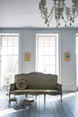
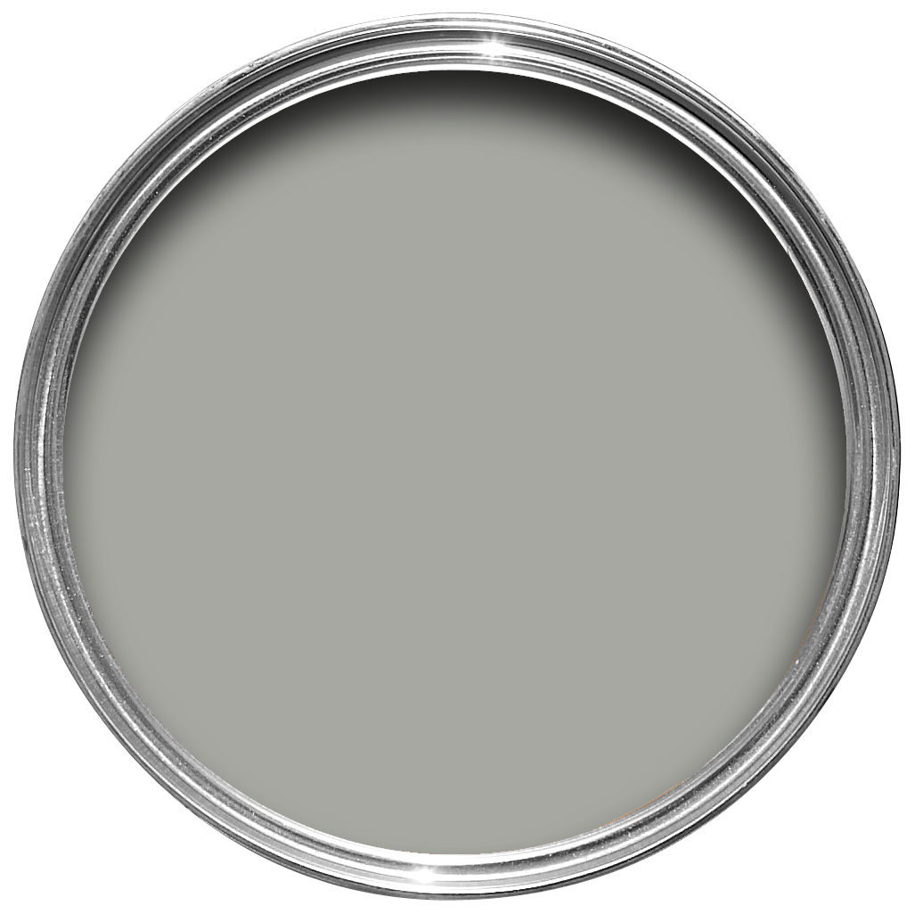
This soft grey green simply earns its name by being the most historic of all our whites. One of our Traditional Neutrals, Old White can read as a subdued green, particularly in north facing rooms, but feels more of a classic grey in well lit spaces. It’s the most sophisticated of colours and feels just as at home in the drawing room of a historic house as it does in the kitchen of a modern family home.
Recommended Primer & Undercoat: Mid Tones
Complementary white: Slipper Satin
Light Gray
A stony grey green
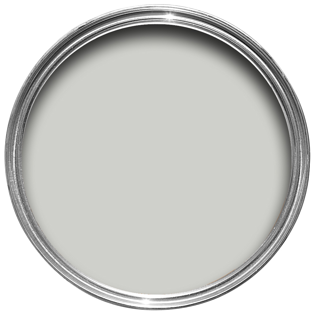
A stony neutral, this traditional grey green was originally used as a colour name in the 9th century – an ancient name for a timeless colour. The subtle green base of our Light Gray brings an unsurpassed depth of colour when used on walls. It is the perfect accent for all our Traditional Neutrals, used on furniture and joinery in many Off-White rooms alongside Old White. It can also be combined with Stiffkey Blue to create a very relaxed, almost mismatched feel.
Recommended Primer & Undercoat: Mid Tones
Complementary white: Clunch
Mouse's Back
A quiet grey brown
This grey brown classic takes its characterful name from the fawny colour of the British field mouse. Much like its namesake, the green based Mouse’s Back is quiet in nature and feels soft in rooms both large and small. It will read greener when used on the walls of underlit rooms and is the perfect accent on furniture or floors when combined with more traditional shades such as Setting Plaster and Lime White.
Recommended Primer & Undercoat: Mid Tones
Complementary white: Off-White
Shadow White
Soft white with a hint of grey
Shadow White takes its name from the soft tone created when whites are used in shaded areas, bringing out the slightest hint of grey. For devotees of lighter neutrals on both walls and woodwork, this versatile and understated colour works brilliantly in any style of home. It has none of the perceived yellow of Slipper Satin and is the perfect contrast to the slightly darker Shaded White.
Recommended Primer & Undercoat: White & Light Tones
Complementary white: Wimborne White
Shaded White
A light grey beige
Neither too warm nor too cool, this neutral takes its name from the soft tone created when many of our whites are used in deep shade. Shaded White has a gentle greyness, but with none of the cooler tones of Cornforth White, making it incredibly versatile within homes both old and new. It is often used alongside lighter shades such as Pointing or Slipper Satin for a restful space, or paired with Drop Cloth for a wonderfully relaxed feel.
Recommended Primer & Undercoat: Mid Tones
Complementary white: Shadow White
Drop Cloth
A gentle mid grey beige
Neither too yellow, nor too grey, Drop Cloth is the traditional name for the indispensable painter’s dust sheet which this muted colour embodies. A nod to our painters and decorators, this mid grey beige is the perfect contrast to our slightly lighter Shaded White and Shadow White, creating a trio of colours that sit effortlessly together in modern and traditional homes, both large and small.
Recommended Primer & Undercoat: Mid Tones
Complementary white: Shadow White
Bone
A soft and stony grey
A soft grey with a touch of green, this stony neutral is simply named after the colour of bones found in the animal kingdom. Softer than Old White, Bone creates a timeless look suited to halls when combined with Lime White on woodwork. It can also be used to create a feeling of light and space when paired with lighter tones; or as a sympathetic neutral with our stronger, more traditional colours.
Recommended Primer & Undercoat: Mid Tones
Complementary white: Lime White
Hardwick White
A traditional grey
This traditional grey was originally created to touch up the old limewash at Hardwick Hall and doesn’t look very white to most, unless contrasted with strong shades like Off-Black. Less blue than Lamp Room Gray and with an unsurpassed depth of colour, Hardwick White’s rich and chalky hue sits just as well in a contemporary room as it does in a historic house.
Recommended Primer & Undercoat: Mid Tones
Complementary white: Clunch
Dimity
A very pale taupe
Dimity is named after the lightweight cotton fabric originally used to make ladies’ bustles, but which is now more commonly used for bedding. One of our Red Based Neutrals, this pale and subdued taupe is brimming with warmth and an unmatchable depth, making it perfect for elegant and understated hallways. It can be combined with All White and Pointing to read pinker, or with the darker Oxford Stone on woodwork for a slightly aged look and relaxed feel.
Recommended Primer & Undercoat: White & Light Tones
Complementary white: Pointing
Joa's White
A light and contemporary taupe
A warm Red Based Neutral named after our first Colour Consultant Joa, who still develops many Farrow & Ball colours. Joa’s White is a light and clean taupe with the merest hint of black pigment which makes it perfect to combine with the limestone, leather and linens often used in contemporary homes.
Recommended Primer & Undercoat: Mid Tones
Complementary white: Dimity
Oxford Stone
A pared back taupe
This classic dark taupe was inspired by the cottages found in the pretty Cotswold villages of Oxfordshire. It is the darkest of our Red Based Neutrals and sits contentedly with both Joa’s White and Dimity for a pared down neutral scheme. Brimming with warmth and an unmatchable depth, the subtle richness of Oxford Stone creates an earthy and uplifting finish from top to bottom, sweeping across woodwork and walls.
Recommended Primer & Undercoat: Mid Tones
Complementary white: Dimity
London Stone
A warm and timeless brown
A warm mid brown, London Stone was created by John Sutcliffe for a classic Nash house in Regent’s Park. With its underlying magenta tones, this unassuming stone colour is the perfect accent for each of our Red Based Neutrals. It feels effortlessly modern when contrasted with Dimity, either on walls or woodwork, and utterly timeless when paired with the stronger Oxford Stone.
Recommended Primer & Undercoat: Mid Tones
Complementary white: Joa’s White
Dead Salmon
An aged salmon pink
A subtle shade whose name refers to the flat or ‘dead’ finish of an aged pink painted at Kedleston Hall in 1805, Dead Salmon has a magical quality to it as everyone sees it differently. Be it a strong mushroom steeped in history, or a warming buff neutral, this deep salmon pink creates the most subtle and serene of environments suitable as a backdrop in candlelit dining rooms.
Recommended Primer & Undercoat: Red & Warm Tones
Complementary white: Dimity
Salon Drab
A deep chocolate brown
This warm drab has a two-part name combining ‘salon’, the small outer room off a drawing room, with a term that describes a colour as lacking in brightness. The richness of this chocolate brown is instantly appealing, effortlessly creating a modern look or classic 19th century feel. Salon Drab works as a dark accompaniment to both the Red Based and Contemporary Neutrals.
Recommended Primer & Undercoat: Dark Tones
Complementary white: Dimity
Strong White
A grey based white
This cool white is both strong by name and strong by nature. One of our Contemporary Neutrals, the subtle urban feel of its light grey undertones add a contemporary twist to period homes, while staying in keeping with modern properties. Pair with Skimming Stone, Elephant’s Breath and All White in any combination for an effortlessly cohesive scheme.
Recommended Primer & Undercoat: White & Light Tones
Complementary white: All White
Ammonite
A naturally understated grey
Ammonite is named after the treasured fossils often found on the Dorset coast. It has a fantastically understated quality, and sits effortlessly with our Easy Neutrals. Neither too warm nor too cool, its subtle grey tone creates a hushed and calming feel in homes both old and new. Try pairing with All White to accent its light grey feel.
Recommended Primer & Undercoat: White & Light Tones
Complementary white: Wevet
Cornforth White
An understated grey
Cornforth White is the mid tone in the group of Easy Neutrals which are totally understated and extremely versatile. Neither too warm nor too cool, Cornforth White sits contentedly between Ammonite and Purbeck Stone to create a hushed and calming retreat. Named in memory of John Cornforth, the revered architectural historian, contrast with Wevet to enhance its grey qualities.
Recommended Primer & Undercoat: White & Light Tones
Complementary white: Wevet
Purbeck Stone
An understated stone grey
Purbeck Stone is a clean and understated mid grey that resembles the colour of stone found on the Isle of Purbeck, close to our home here in Dorset. Purbeck Stone is the strongest of our Easy Neutrals, sitting contentedly as part of a calming scheme with Cornforth White, Wevet and Ammonite in homes both old and new.
Recommended Primer & Undercoat: Mid Tones
Complementary white: Wevet
Worsted
A rich grey
This rich mid grey conjures memories of city suits made from flat woven fabric, so was named after the Norfolk village where the yarn was originally woven. For devotees of our Easy Neutrals, Worsted is stronger in tone than its counterpart Purbeck Stone, but lighter than Mole’s Breath. It has an understated richness with no cold tones, making it the perfect background to make clean accent colours pop.
Recommended Primer & Undercoat: Mid Tones
Complementary white: Shadow White
Mole's Breath
A moody grey
A timeless grey whose name takes its roots from the much loved Elephant’s Breath, this moody hue is inspired by a smaller, furrier animal. Mole’s Breath is the most versatile of our stronger accents as it can be used both with Easy Neutrals like Purbeck Stone and Contemporary Neutrals like Strong White. It is particularly effective to ground kitchen islands and when used on the walls of smaller spaces to create a fabulously sullen yet warm room.
Recommended Primer & Undercoat: Dark Tones
Complementary white: Ammonite
Cromarty
A muted blue grey
This very light blue grey is named after the Cromarty Firth estuary, a place of swirling mists mentioned daily in the Shipping Forecast. A neutral yet atmospheric colour, Cromarty brings a muted softness to any room, creating an easy to use finish that is neither too blue nor too grey. A shade lighter than Mizzle, it works beautifully when grouped with Blue Gray or Pigeon.
Recommended Primer & Undercoat: Mid Tones
Complementary white: Shadow White
Mizzle
A soft grey green
This modest grey green is named after West Country evening skies when there is a mix of both mist and drizzle. The addition of green pigment diminishes any cool blue tones, creating a lighter shade of Pigeon and Blue Gray. Rooms feel soft and contented when painted in this rather indeterminate colour.
Recommended Primer & Undercoat: Mid Tones
Complementary white: Wimborne White
Blue Gray
A cool blue grey
With its subtle mix of blue, green and black pigments, Blue Gray creates the most relaxed of rooms that feel as if they have always been there. It is a cooler, more weathered version of French Gray and has the same almost magical quality of gently shifting between blue and grey depending on the light and time of day.
Recommended Primer & Undercoat: Mid Tones
Complementary white: Shaded White
Pigeon
A strong blue grey
This cosy and nostalgic blue grey is named after the colour of the bird often sighted around the London landscape. Softer and bluer than more contemporary grey shades like Mole’s Breath, Pigeon is particularly suited for use in boot rooms, cloakrooms or darker spaces like studies and panelled rooms. It is also incredibly popular on kitchen islands with the more delicate Dimpse on units.
Recommended Primer & Undercoat: Mid Tones
Complementary white: Shaded White
French Gray
A soothing green grey
French Gray is really much more green than grey, but characterfully flits between the two depending on the light and time of day. Taking inspiration from French decoration and wallpapers used in the 19th century, it creates the most relaxed of rooms. This soothing hue is perfect for exterior woodwork and a particular favourite for front doors in our matt Exterior Eggshell, or garden furniture where it sits seamlessly amongst the greenery.
Recommended Primer & Undercoat: Mid Tones
Complementary white: Lime White
Blackened
A cool white
Our coolest white, with the slightest hint of grey, was historically made with the addition of lamp black pigment gathered from the smoke of burning oil lamps. Blackened sits perfectly with each of our Architectural Neutrals for a minimal look or stronger industrial feel. It’s particularly spectacular when used in Full Gloss within stainless steel kitchens, or when paired with All White for an uncompromisingly modern finish.
Recommended Primer & Undercoat: White & Light Tones
Complementary white: All White
Dimpse
A cool and delicate grey
Dimpse is a delicate grey named after the quaint West Country dialect for the colour of twilight and is one of our cooler Architectural Neutrals. Sitting between Pavilion Gray and Blackened, its subtle blue undertones work particularly well in modern architectural spaces. Brush onto kitchen units alongside a Down Pipe island for a clean finish that is conducive to minimal living.
Recommended Primer & Undercoat: White & Light Tones
Complementary white: All White
Pavilion Gray
A cool mid grey
This classic mid grey was originally created for a bespoke pavilion, but is also reminiscent of an elegant 18th century Swedish colour. One of the Architectural Neutrals, the subtle blue undertones of Pavilion Gray add a contemporary touch and sense of spaciousness. Combine with Dimpse, Blackened or Manor House Gray in any combination for a scheme that is perfect for the modern family home.
Recommended Primer & Undercoat: Mid Tones
Complementary white: Blackened
Lamp Room Gray
Our traditional mid grey
Our most traditional blue grey was originally created when a white room had been stained by the trimming of lamp wicks. Lamp Room Gray creates a softer more lived in finish than Pavilion Gray, while retaining a sense of timelessness. It is surprisingly strong when used in smaller rooms but softens in larger, well lit spaces.
Recommended Primer & Undercoat: Mid Tones
Complementary white: Strong White
Manor House Gray
A cool architectural grey
Named after the houses traditionally inhabited by the local lord, Manor House Gray is a definite grey which retains its colour in all lights, especially when contrasted with Wevet. Cooler and cleaner in feel than Charleston Gray, this Architectural Neutral is very popular in hard-edged contemporary homes that are conducive to minimal living and is often used alongside the more dramatic Railings.
Recommended Primer & Undercoat: Dark Tones
Complementary white: Blackened
Plummett
A lighter lead
This strong architectural grey is named after the lead often used by fishermen to weight their lines. Plummett intensifies in colour in smaller spaces and has a strikingly modern feel which is conducive to minimal living. Used as much on woodwork to define dramatic spaces as it is on walls, Plummett is one of our most hard-edged and industrial feeling greys.
Recommended Primer & Undercoat: Dark Tones
Complementary white: Ammonite
Skimming Stone
A warm light grey
This stony off white takes its name from a 19th century skim, or plaster colour, but often reminds us of childhood afternoons skimming stones. With its warm light grey undertones, Skimming Stone is extremely versatile and particularly suited to soothing bedroom schemes. One of our Contemporary Neutrals, it sits with the lighter Strong White and darker Elephant’s Breath for a clean and contemporary look, but can also be used in a darker statement scheme alongside Pelt or London Clay.
Recommended Primer & Undercoat: White & Light Tones
Complementary white: Strong White
Elephant's Breath
A warm mid grey
This warm and contemporary grey is renowned for its characterful paint name, originally created by John Fowler, the notable English interior designer. Elephant’s Breath reads as an uplifting mid grey with its hint of magenta, but can become almost lilac in the cooler light of west facing rooms. Try offsetting with Charleston Gray and London Clay for an invitingly earthy scheme with more intense accents, or pair with other Contemporary Neutrals such as the softer Strong White for a sense of neutrality and calm.
Recommended Primer & Undercoat: Mid Tones
Complementary white: Strong White
Dove Tale
A warm grey with lilac undertones
Dove Tale is a darker version of Elephant’s Breath and is perfect for those who are hoping for a warm grey finish. Typical of the colours used by the bohemian Bright Young Things between the wars, it is the perfect choice for the bedroom as its gentle lilac undertone create a soft and inviting feel. Pair with Skimming Stone for the most flattering and subtle scheme.
Recommended Primer & Undercoat: Mid Tones
Complementary white: Strong White
Charleston Gray
A deep, warm grey
A warm and muted grey, Charleston Gray is named after the much loved home of the equally artistic and intellectual Bloomsbury Group in West Sussex. Very popular for use in modern living rooms, its brown undertones create a warm, enveloping and hushed atmosphere. It is the perfect accent colour for all the warm Contemporary Neutrals or can be used on woodwork with rich Brinjal.
Recommended Primer & Undercoat: Dark Tones
Complementary white: Skimming Stone
London Clay
Our warmest brown
A warm and charming brown, London Clay is loaded with magenta pigment for a rich, earthy hue that creates the most charismatic and elegant of rooms. So named because it is a deeper accent to London Stone, consider using this dark brown in a hall or transitional area to make the rooms coming off it feel much lighter and brighter. London Clay is also the perfect accent for both Elephant’s Breath and Charleston Gray.
Recommended Primer & Undercoat: Dark Tones
Complementary white: Skimming Stone
Brinjal
A sophisticated aubergine
Brinjal takes its name from the beautifully deep and shiny skin of the aubergine, so it is particularly magnificent in Full Gloss. It can create a warm and highly sophisticated finish when used on all walls, but is more often used as a feature wall to enhance a neutral Skimming Stone scheme or as an accent on the underside of a bath or kitchen island.
Recommended Primer & Undercoat: Red & Warm Tones
Complementary white: Skimming Stone
Peignoir
A romantic grey pink
This grey pink has a romantic feel inspired by the chiffon gowns in which ladies traditionally brushed their hair. Created by giving the softest of pinks a big dose of grey, Peignoir has a unique depth which brings walls to life. It works perfectly in homes both old and new with any of our Contemporary Neutrals, or with Brassica and Pelt.
Recommended Primer & Undercoat: Mid Tones
Complementary white: Wimborne White
Calluna
A tranquil lilac
Calluna takes its name from the beautiful heather so prolific across the moors of Scotland. A touch of black ensures that it appears more lilac than pink, making this colour feel both soft and tranquil yet strangely sophisticated. It can be contrasted with sympathetic Great White or used with darker Brassica and Pelt to great effect.
Recommended Primer & Undercoat: White & Light Tones
Complementary white: Wimborne White
Brassica
A dark and sophisticated lavender
Brassica’s rich lavender tones feel both feminine and charming in light areas, but become much more sophisticated and grey in darker areas due to an underlying hint of black. Named after the group of plants which includes purple sprouting broccoli, this warm shade lifts cold feeling rooms without being overtly red. It is often combined with Elephant’s Breath and Skimming Stone for a rich, contemporary feel.
Recommended Primer & Undercoat: Dark Tones
Complementary white: Great White
Pelt
A deliciously deep purple
This deep and luxurious purple has a regal feel and derives its name from untreated animal hides. Much bluer in feel than the similarly strong Brinjal, Pelt can appear almost black in darker spaces and is particularly sensational in Full Gloss. Pair with Brassica to create a dark and moody scheme or soften with the feminine shades of Middleton Pink and Great White.
Recommended Primer & Undercoat: Dark Tones
Complementary white: Great White
Middleton Pink
A delicate pink
Our prettiest and most delicate pink was named after the discerning colourist, Catherine Middleton. This light pastel tone is fresh and uncomplicated, especially when contrasted with All White for a gently playful feel. Try pairing our Middleton Pink with Great White for a slightly cleaner urban finish.
Recommended Primer & Undercoat: White & Light Tones
Complementary white: All White
Calamine
Delicate pink with a touch of grey
Calamine is indeed named after the lotion we all used as children to soothe nettle stings and rashes! A light touch of grey prevents this subtle pink from being too sugary, giving a much fresher finish. In smaller rooms it becomes intense, but in larger well lit rooms it feels much more delicate.
Recommended Primer & Undercoat: White & Light Tones
Complementary white: Great White
Nancy's Blushes
Our truest pink
This true pink is named after the scrumptious rosy cheeks of a much loved little girl called Nancy. The uplifting shade of Nancy’s Blushes certainly grabs your attention when paired with a bright white, but can create quietly charming interiors when contrasted with a soft neutral in shady rooms. Something altogether more graphic happens when counterbalanced with St Giles Blue.
Recommended Primer & Undercoat: White & Light Tones
Complementary white: Great White
Red Earth
A warm terracotta red
This light terracotta hue takes its name from the very soil beneath our feet. Red Earth is a rich blend of red and yellow pigments which create a warm earthy feel in homes both old and new. Often best used in smaller spaces, this warm colour responds extraordinarily to the changes of light throughout the day, becoming deeper and cosier as the sun drops.
Recommended Primer & Undercoat: Red & Warm Tones
Complementary white: Dimity
Picture Gallery Red
A rich brown based red
This timeless red is based on the rich colour of the magnificent gallery at Attingham Park. A generous helping of brown pigment deepens Picture Gallery Red, bringing a unique warmth and character. As its name suggests, this ruddy hue creates a striking backdrop for works of art, be they hand drawn in crayon or expertly painted in oil.
Recommended Primer & Undercoat: Red & Warm Tones
Complementary white: Joa’s White
Incarnadine
A classic crimson
Our richest crimson originally takes its name from Latin, but is now a much used term for crimsons and reds. Similar to the deep glossy red used by David Hicks at Barons Court in the 1970s, Incarnadine is unashamedly classic and glamorous. It can be used to sumptuous effect in halls when offset with Tanner’s Brown on woodwork, or feel more edgy and graphic when paired with a bright white.
Recommended Primer & Undercoat: Red and Warm Tones
Complementary white: Wimborne White
Great White
White with the slightest lilac hint
This elegant white is not named after a shark, but simply refers to how wonderful the colour is! Great White appears to be a very pale lilac when contrasted with our All White, making it perfect for children’s bedrooms when wanting to keep a fairly neutral scheme. Despite its red undertone, it is not the warmest of pinks. The inclusion of the merest amount of black lifts it to a wonderfully sophisticated shade with an extraordinary depth of colour.
Recommended Primer & Undercoat: White & Light Tones
Complementary white: All White
Cinder Rose
A wildly romantic rose pink
Cinder Rose has barely any of the yellow pigment found in most pinks, making it feel bluer and more romantic. Taking its name from the prettiest of traditional roses, it is the perfect colour for creating a dusky feel in a bedroom, but is also much favoured in garden rooms when paired with complementary Skimming Stone. To enhance its softness, try using Great White on your woodwork.
Recommended Primer & Undercoat: Mid Tones
Complementary white: Great White
Pink Ground
A dusty blush pink
This dusty pink started out as a delicate wallpaper background which was often requested as a paint colour. Pink Ground, with its large dose of yellow pigment, now creates the softest blush of colour for a warm and soothing finish that doesn’t feel sugary. Rather than contrasting with a bright white, try pairing with the warmer shade of Great White on the woodwork for a unique look in your home.
Recommended Primer & Undercoat: White & Light Tones
Complementary white: Tallow
Setting Plaster
A dusty plaster pink
This dusty pink is named after the blushing walls we often admire in newly plastered houses. It is definitely a pink in historic terms, but has a certain softness to it due to the inclusion of yellow pigment. Our timeless Setting Plaster creates a wonderful backdrop to antique furniture, and also works incredibly well when paired with Mahogany in a more contemporary home.
Recommended Primer & Undercoat: White & Light Tones
Complementary white: Tallow
Rectory Red
A rich red
This rich clean red is named after the charming village houses built over the years for the clergy. Rectory Red is a blackened and aged version of Blazer and feels much more sophisticated, especially when contrasted with Red Based Neutrals such as Joa’s White. It is a warming colour which will intensify when used in a small space to create the most welcoming of rooms.
Recommended Primer & Undercoat: Red & Warm Tones
Complementary white: Dimity
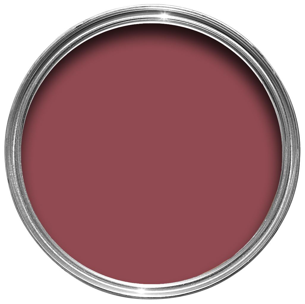
Eating Room Red
A rich burgundy
The deep blackened pigmentation of our Eating Room Red gives a rich burgundy finish with a wonderfully aged feel. This, our most elegant red, takes its name from the colouring of the red damasks so popular in dining rooms in the mid-19th century and reads almost like a saturated purple if you compare it to the more modern looking Incarnadine.
Recommended Primer & Undercoat: Red & Warm Tones
Complementary white: Joa’s White
Radicchio
A modern crimson
This bright and modern red takes its name from the distinctive crimson leaves of Italian chicory. Although tempered with magenta, Radicchio contains less blue pigment than Eating Room Red so is brighter and more contemporary in feel. It confidently fills a room with energy without having the brashness of a true, clean red.
Recommended Primer & Undercoat: Red & Warm Tones
Complementary white: Joa’s White
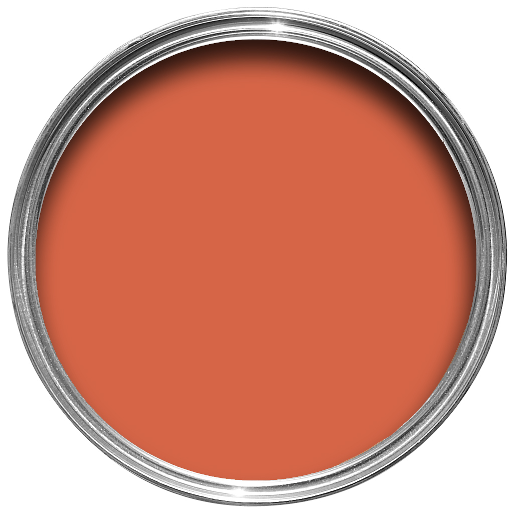
Charlotte's Locks
A deep and playful orange
Charlotte’s Locks takes its inspiration from the flame red hair of our Head of Creative and brings a playful late 1970s look. This deep and dramatic orange is particularly spectacular when used in small areas with a sharp contrast either in All White or Black Blue – for the very brave, do try in Full Gloss!
Recommended Primer & Undercoat: Red & Warm Tones
Complementary white: All White
Blazer
A brilliant red
Blazer is a bright and cheerful vermilion which reads like a cleaner, more contemporary version of Rectory Red. It grabs your attention just like the sports blazers worn at St John’s College, Cambridge after which it was named. Close in colour to orange, this rich hue is both regal and charming.
Recommended Primer & Undercoat: Red & Warm Tones
Complementary white: Joa’s White
House White
A clean citrus white
This clean off white, with its slight green undertone, has an almost citrus feel which brings with it a bright and fresh finish. Not to be thought of as a pretty cream, its subtle citrus tone is relevant to any house of any period, be it yours or ours! House White is often paired with All White when used on walls, or as a woodwork colour when used with the stronger, fresher greens like Studio Green.
Recommended Primer & Undercoat: White & Light Tones
Complementary white: All White
Pale Hound
Delicately aged yellow
This pale and aged yellow is a lighter version of an archived Farrow & Ball colour, Hound Lemon. Named by the great colourist John Fowler, the story behind its namesake remains a mystery! Pale Hound sits particularly well in sunny spaces where it reads as a light and delicate yellow, and in garden rooms where its underlying green pigment connects seamlessly with the exterior.
Recommended Primer & Undercoat: Mid Tones
Complementary white: Wimborne White
Dayroom Yellow
A refreshing pale yellow
A typical Regency colour, this charmingly simple pale yellow takes its name from the rooms which were filled with light and enjoyed during the day. Perhaps the most refreshing in feel of all Farrow & Ball colours, Dayroom Yellow is perfect for use in rooms of a sunny disposition, flooding the space with light and colour particularly when contrasted with All White.
Recommended Primer & Undercoat: White & Light Tones
Complementary white: Wimborne White
Citron
A warm lemon yellow
Citron, as the name suggests, is a warm Mediterranean yellow which has a bright intensity in small spaces and is fantastically welcoming in halls. It is softer in well lit rooms but is perhaps a little too stimulating for the bedroom. Try contrasting with House White on ceilings and woodwork.
Recommended Primer & Undercoat: White & Light Tones
Complementary white: House White
Yellow Ground
A timeless mid yellow
One of our most usable yellows, this sunny shade was first used as a background colour within our ever evolving wallpaper collection. Yellow Ground sits between the fresher pigments of Citron and the richer mustard tone of Sudbury Yellow. It creates a happy and stimulating space in any light without being overpowering in colour.
Recommended Primer & Undercoat: White & Light Tones
Complementary white: White Tie
Babouche
A cheerful yellow
Babouche takes its exotic name from the distinctive colour of the leather slippers worn by men in Morocco. It has a cheerful brightness that will intensify when used in large areas, but it is always dignified and never garish. Babouche can be paired with Railings for a very modern but sumptuous effect.
Recommended Primer & Undercoat: White & Light Tones
Complementary white: House White
Tallow
A light cream
This illuminating neutral takes its name from the natural material originally used to make candles. Tallow’s pale cream finish reflects the light brilliantly so it is perfect if you want to lift a darker space or paint one colour throughout a property. The slightest hint of pink and yellow pigment creates a warm but fresh feel which is often very popular in nurseries.
Recommended Primer & Undercoat: White & Light Tones
Complementary white: Pointing
Farrow's Cream
A traditional cream
Our original cream is named after the paint pioneer who first founded the company with Richard Ball in Dorset, England. Farrow’s Cream is a pretty, traditional colour, with no addition of black pigment, which creates delightfully inviting rooms with a gentle warmth. It feels just as at home on the panelling of a 17th century hall as it does on the wooden cupboards of a relaxed family kitchen.
Recommended Primer & Undercoat: Mid Tones
Complementary white: White Tie
Dorset Cream
A rich double cream
Dorset Cream’s name conjures up exactly the right colour in our minds; a rich double cream made in the heart of the West Country. A darker and more yellow version of Farrow’s Cream, it should never be used with a bright white but with a sympathetic Yellow Based Neutral like New White, to create a gentle warmth and charmingly traditional scheme.
Recommended Primer & Undercoat: Mid Tones
Complementary white: New White
Hay
A dusty yellow
A modest yellow named after the dried crop, Hay is both warm and dusty. Less intense and sunny than the cleaner Yellow Ground, it has a distinctly green undertone which gives it an established feel, creating peaceful spaces especially when contrasted with muted Lime White woodwork.
Recommended Primer & Undercoat: Mid Tones
Complementary white: James White
Sudbury Yellow
A traditional mid yellow
This soft mid yellow takes its name from the staircase at Sudbury Hall, where renowned colourist John Fowler used this shade to such great effect. Sudbury Yellow is particularly responsive to changes in light, reading as cleaner and brighter in well lit rooms or softening in dimly lit spaces alongside a stronger contrast like New White.
Recommended Primer & Undercoat: Mid Tones
Complementary white: New White
India Yellow
A strong and moody yellow
This deep mustard yellow is famously named after the pigment collected from the urine of cows fed on a special diet of mango leaves! It creates a really cosy and surprisingly un-yellow space when contrasted with a dark tone like Tanner’s Brown. It should, however, be used in moderation in small rooms where its moody intensity may be a little overwhelming.
Recommended Primer & Undercoat: Mid Tones
Complementary white: Matchstick
Green Ground
A pale and fresh green
This refreshing green is a lightened version of Cooking Apple Green, created as a background colour to some of our prettiest botanical wallpapers. The paleness of Green Ground has a calming feel, so is well suited to use in kitchens to create a contented family atmosphere. Often paired with a bright white to enhance its colour, it can also be used on panelling with our darker Green Smoke to create a reassuringly historic look that seems as if it’s always belonged.
Recommended Primer & Undercoat: White & Light Tones
Complementary white: James White
Cooking Apple Green
A fresh iconic green
Cooking Apple Green is a Farrow & Ball classic which always feels charmingly familiar and, like all greens, creates the feeling of health and vigour. It has a rich, old fashioned look in darker situations, but often feels much fresher and brighter in well lit rooms and when contrasted with a bright white.
Recommended Primer & Undercoat: Mid Tones
Complementary white: James White
Ball Green
An established silvery green
This muted green is a tribute to Richard Ball, the paint pioneer who first founded our company in Dorset, England with John Farrow. It is an old distemper colour with a more sober, established feel than fresh Cooking Apple Green. It has a magical quality of appearing almost silver in candlelight, so is great for use in dining rooms.
Recommended Primer & Undercoat: Mid Tones
Complementary white: James White
Card Room Green
A masculine grey green
This dark grey green is named after the study like rooms much favoured in the Victorian period and is unapologetic in its masculine feel. It really comes alive when contrasted with a warm neutral like Off-White or set against the darker Studio Green, but feels more contemporary when used with no contrasts at all.
Recommended Primer & Undercoat: Dark Tones
Complementary white: Lime White
Green Smoke
A dark and smoky green
A smoky green blue, this colour was popular in interiors during the late 19th century. It has an irresistibly inviting deepness and weathered familiarity when used in exterior situations, while evoking calm and serenity when used inside.
Recommended Primer & Undercoat: Dark Tones
Complementary white: Off-White
Studio Green
A deep, dark green
Our darkest green is also the colour painted on the original studio at Farrow & Ball, where many of our very first colours were created. When brushed onto exterior surfaces, the rich pigments respond extraordinarily to all types of light and magically appear much greener than on our colour card. Within the home, this deep hue appears almost black unless in very well lit rooms.
Recommended Primer & Undercoat: Dark Tones
Complementary white: Lime White
Churlish Green
A yellow based green
Churlish Green takes its name from the old English definition relating to simple peasant life. With its highly pigmented yellow base, this mid green creates a totally unique look which makes it a statement colour when contrasted with shades as strong as Tanner’s Brown. It is also fabulous when used in Full Gloss.
Recommended Primer & Undercoat: Mid Tones
Complementary white: James White
Yeabridge Green
A bright avocado green
This fresh avocado green was discovered in an 18th century Georgian farmhouse in Yeabridge, Somerset, when the original gun cupboard was removed. Although untouched for many years, it was still astonishingly bright and reminiscent of the lush grass that surrounds the house. This uncomplicated, clean green sits happily in both contemporary settings and period homes. It has a little more yellow than Breakfast Room Green but a little less than Churlish Green. Pair with Hague Blue to create a truly uplifting interior.
Recommended Primer & Undercoat: Mid Tones
Complementary white: James White
Breakfast Room Green
A cheerful green
Breakfast Room Green is the most cheerful of all our greens, remaining lively in both bright sunlight or softer candlelight. Named after the usually east facing rooms designed for eating the first meal of the day, it is particularly beautiful in the dawn light. When used alone on both walls and woodwork it becomes incredibly striking.
Recommended Primer & Undercoat: Mid Tones
Complementary white: James White
Calke Green
A traditional sage green
This rich and traditional green is a cleaned version of a colour originally found in the breakfast room at Calke Abbey. It is best used either on its own on both walls and woodwork, or with a darker neutral like Old White to enhance its deep sage notes. It is particularly suitable for smaller rooms and studies due to its dark and intimate feel.
Recommended Primer & Undercoat: Dark Tones
Complementary white: Slipper Satin
Arsenic
A lively mint green
Arsenic has a lively, stimulating feel despite its name being derived from the poison that was rumoured to have been in the wallpaper that poisoned Napoleon after his capture. Its vivid mint colour makes it feel just as at home on contemporary kitchen cabinets, especially when paired with Down Pipe, as it does on the walls of a 19th century dining room.
Recommended Primer & Undercoat: Mid Tones
Complementary white: All White
Vert De Terre
A delicate aged green
This fresh and incredibly soft green is reminiscent of the pigment green earth. With its blue undertone it creates the softest of atmospheres, being less intense and cooler than Cooking Apple Green but fresher and less grey than Ball Green.
Recommended Primer & Undercoat: Mid Tones
Complementary white: Slipper Satin
Lichen
A mid aged green
This calm and muted green is named after the ever changing, subtle colour of creeping algae which ages stone so beautifully. It has a quiet and subtle feel to it, due to its underlying blue tone, and is perfect for use in the garden where it feels totally at one with nature. It works wonderfully as a darker accent to Vert de Terre too.
Recommended Primer & Undercoat: Mid Tones
Complementary white: Lime White
Oval Room Blue
A darkened historic blue
Oval Room Blue is the most blackened of our blues, giving it a subtly aged feel. Named after the attractively shaped rooms of the late 18th century, it sits perfectly with our popular greys to create depth and balance in either a hall or a darker, cosier family room.
Recommended Primer & Undercoat: Mid Tones
Complementary white: Shadow White
Stone Blue
A lively blue
This warm and timeless blue is named after the indigo pigment which was often imported in lumps in the 18th century. Stone Blue’s lively and saturated colour can be used alongside warmer tones such as Pelt to create an inviting vintage look, or the cooler Mole’s Breath for a cleaner, more contemporary feel. When contrasted with Dimpse woodwork, however, it feels both distinguished and familiar.
Recommended Primer & Undercoat: Mid Tones
Complementary white: Strong White
Inchyra Blue
A dark blue grey
This aged blue grey is inspired by the naturally dramatic Scottish skies that act as a backdrop for the classic Georgian Inchyra House. It can be found on the exterior doors of their very impressive byre or barn which nestles at the bottom of a rather grey and imposing brae (also known as a hill). Such is the magic of our colours, this moody hue can read more grey, blue or even green depending on the light. A great alternative to charcoal, use it to inject a hint of colour into a super contemporary home or create a dark and intimate feel by combining it with Black Blue or Vardo.
Recommended Primer & Undercoat: Dark Tones
Complementary white: Shaded White
Pavillion Blue
A delicate green blue
This fresh green blue is inspired by the wonderful Regency colours of the Royal Pavilion in Brighton, although a little lighter in tone. When teamed with All White it creates a clean and delicate finish, without feeling too cool, making it a brilliant choice for bathrooms. Pavilion Blue can also be used on woodwork with stronger tones such as Green Blue.
Recommended Primer & Undercoat: White & Light Tones
Complementary white: All White
Pale Powder
A gentle aqua
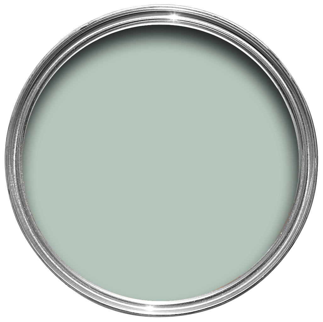
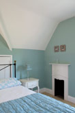
Our most popular shade of aqua is a lighter version of an archived Farrow & Ball colour, Powder Blue. Pale Powder has an unparalleled softness and in north facing rooms can read almost as a delicate grey, but it is rarely cold due to the addition of green pigment. It is a great favourite for use in pretty attic bedrooms where it can be brushed onto both ceiling and walls to create an airy feeling of light and space.
Recommended Primer & Undercoat: White & Light Tones
Complementary white: Pointing
Teresa's Green
A fresh aqua tone
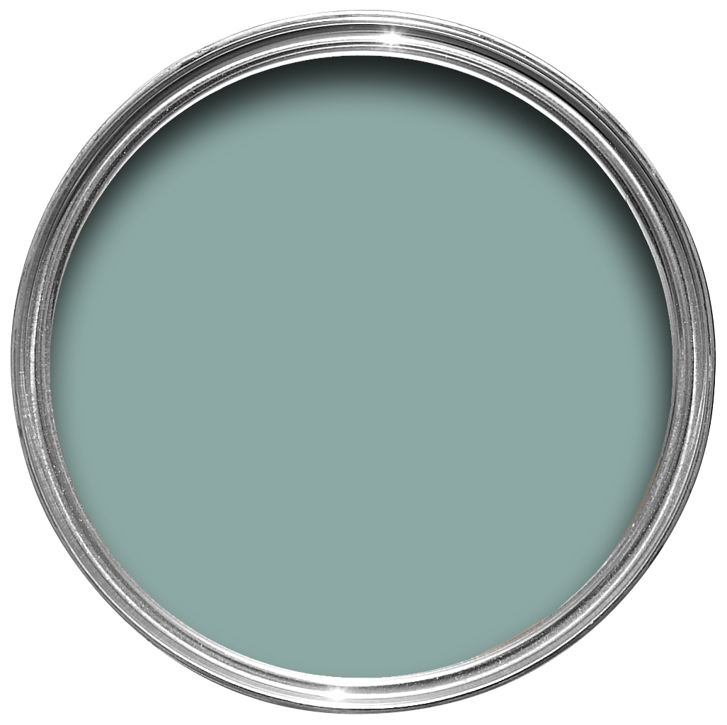
This mid aqua is named after a much valued, early member of our creative team – and yes, the pun is intended! Teresa’s Green owes its freshness to a rich blue base and its warmth to soft green undertones. In the middle of our range of aquas, Teresa’s Green has a calming and therapeutic effect, but still feels cheerful when combined with delicate shades like White Tie.
Recommended Primer & Undercoat: Mid Tones
Complementary white: Slipper Satin
Green Blue
Quite simply green blue
This chameleon colour needs no other name, it is exactly what it says – sometimes blue and sometimes green depending on the changing light throughout the day. Green Blue is a great favourite for family bathrooms, as the soft green adds warmth while the light blue brings a certain freshness. Try pairing with Pale Powder walls as a lighter accent.
Recommended Primer & Undercoat: Mid Tones
Complementary white: Pointing
Dix Blue
A relaxed green blue
This vintage blue takes its name from one of the first Farrow & Ball stockists based in East Anglia. Like many of our blues, Dix Blue has a large dose of green included in it, making it both warm and easy to live with. A touch of black pigment brings a slightly aged and relaxed vintage feel, making it perfect for use on upcycled furniture, panelling and woodwork, as well as living room walls.
Recommended Primer & Undercoat: Mid Tones
Complementary white: Clunch
Vardo
A rich teal
This rich teal takes its name from highly decorated traditional horse drawn Romany wagons. Often used in the intricate patterning of these beautifully painted homes, Vardo is so full of life and joy it seemed natural to name it after something renowned for its flamboyant colour. This bright colour works particularly well with reds or dark greys.
Recommended Primer & Undercoat: Dark Tones
Complementary white: Shaded White
Borrowed Light
A pale and illuminating blue
Evoking the colour of summer skies, Borrowed Light is a wonderfully pale blue named after the delicate light that cascades through small windows and fanlights. It works as well in a room deprived of light as it does in an airy sunroom. This soft and classic tone is perfectly suited to children’s bedrooms, especially when contrasted with Stiffkey Blue on furniture or woodwork.
Recommended Primer & Undercoat: White & Light Tones
Complementary white: All White
Skylight
A pale and traditional blue
This pale blue grey takes its name from the soft natural light that often pours through ceiling skylights. However, it is less reflective than Borrowed Light, reading as a definite cool blue when used in small spaces but becoming paler and greyer when used in larger areas.
Recommended Primer & Undercoat: White & Light Tones
Complementary white: All White
Light Blue
A light silvery blue
This silvery blue was so named because it was the lightest blue Farrow & Ball made in its first collection of colours. Light Blue becomes a little more silver in tone when used in shaded areas so is very popular for use on the walls of internal halls, especially when the remainder of the house is painted in cooler, more neutral greys. When used in well lit areas it feels both peaceful and calming, especially when paired with a cool white like Blackened.
Recommended Primer & Undercoat: Mid Tones
Complementary white: Strong White
Parma Gray
A cool mid blue
Reading as a cool blue, Parma Gray is another colour attributed to the great colourist John Fowler. Used as the backdrop to numerous costume dramas, it creates the perfect period feel when contrasted with Wimborne White. Though its cool nature can feel quite formal when contrasted with a bright white, it is a firm favourite for those who prefer a clean and crisp finish.
Recommended Primer & Undercoat: Mid Tones
Complementary white: Wimborne White
Lulworth Blue
A fresh mid blue
This fresh mid blue’s name comes from the shade of the sea at beautiful Lulworth Cove, Dorset. Typical of a formal Regency hue, Lulworth Blue sits happily alongside similarly clean Wimborne White and Parma Gray. Despite its brightness, it can promote deep and peaceful sleep when used in low lit rooms, especially when used on both walls and woodwork.
Recommended Primer & Undercoat: Mid Tones
Complementary white: All White
Cook's Blue
A vibrant blue
Cook’s Blue was inspired by the rich and poignant finish in the cook’s closet at Calke Abbey where the walls had been untouched for many decades. This bright and deeply pigmented colour is perfect for use both in kitchens and exterior eating areas, as this vibrant tone is said to deter flies! But it is perfectly at home anywhere in the house.
Recommended Primer & Undercoat: Dark Tones
Complementary white: All White
Cabbage White
The slightest hint of blue
A subtle white with the slightest hint of blue, Cabbage White takes its name from the most delicate of butterflies. This palest of blues is perfect for rooms that go up into the eaves where you want to use just one colour on both walls and ceiling. This colour really comes into its own when contrasted with All White.
Recommended Primer & Undercoat: White & Light Tones
Complementary white: All White
Blue Ground
A clean mid blue
First used as a wallpaper ground colour in our damask collection, Blue Ground creates an upbeat and happy atmosphere which is often used in playrooms as an accent colour alongside Wevet or James White. This clean mid blue tone is both optimistic and friendly, but never cold.
Recommended Primer & Undercoat: Mid Tones
Complementary white: Pointing
St Gile's Blue
A vivid blue
This clean and vivid blue is inspired by a colour originally found in the hall at 17th century St Giles House in Wimborne St Giles, Dorset. Its striking blue hue cannot fail to make you smile and will hold its own even in the darkest of places, so is often used as an accent in the back of bookshelves.
Recommended Primer & Undercoat: Mid Tones
Complementary white: All White
Pitch Blue
A lively cobalt blue
This strong cobalt blue, with its dose of black pigment, takes its name from the dark sticky tar often used in roofing. Pitch Blue has an almost purple feel to it and is extremely lively in south facing rooms, especially when contrasted with bright shades such as All White. However, it looks more sober and rich when used in areas deprived of light or those lit in the evening by candles.
Recommended Primer & Undercoat: Dark Tones
Complementary white: Blackened
Stiffkey Blue
An inky navy
This inky blue is named after the Norfolk beach where the mud, along with the cockles, share a particular deep navy hue. Although traditional in feel, Stiffkey Blue is often used as an alternative to Down Pipe to create a richly dramatic space with a more contemporary finish. When used in well lit areas of the home it will appear much bluer, working wonderfully when contrasted with Ammonite.
Recommended Primer & Undercoat: Dark Tones
Complementary white: Shadow White
Hague Blue
A deep dark blue
This strong blue takes its name from the fantastically coloured woodwork much used by the Dutch, and still works wonderfully to ground skirting’s or as an accent colour on the walls when teamed with Borrowed Light. The green undertones of this timeless, deep and dramatic blue means it sits as happily outside as it does in small dark rooms.
Recommended Primer & Undercoat: Dark Tones
Complementary white: Old White
Mahogany
A dark and rich brown
Mahogany is an invitingly rich brown which takes its name from the dark red wood used by master cabinet makers like Thomas Chippendale. Packed with warm tones that give a unique depth of colour, the almost burnt brown pigments create a welcoming retreat which envelopes the room in an earthy darkness. Often used with Dead Salmon to enhance historic art and antique furniture.
Recommended Primer & Undercoat: Dark Tones
Complementary white: Joa’s White
Tanner's Brown
A strong dark brown
Our darkest drab is named after the craftsmen who tan the hides and skins used to create leather. Tanner’s Brown will read as almost black in lower lighting and is extremely useful to create a slightly softer look when used on the interior of fireplaces. It does, however, become browner in colour within well lit homes and exteriors due to its warm red undertones.
Recommended Primer & Undercoat: Dark Tones
Complementary white: Joa’s White
Down Pipe
A dramatic lead grey
Down Pipe, a dark lead grey, has definite blue undertones to it which deepen the complexity of the finish. Originally inspired by the colour used to paint downpipes and guttering, it has been embraced for use inside the home with fanatical zeal! This daringly dark hue is fabulous as a background to art, and extremely effective for use in halls to create a deeply dramatic entrance to the home.
Recommended Primer & Undercoat: Dark Tones
Complementary white: Dimpse
Railings
A soft black with blue undertones
More blue than black, Railings is a softer alternative to black which is particularly suited to the ironwork it takes its name from. When used in Full Gloss on front doors it creates a handsome and commanding entrance, but becomes much more relaxed in feel in our Estate Eggshell finish. The bluer undertones of this dark hue transform rooms into dramatic and enveloping interior spaces.
Recommended Primer & Undercoat: Dark Tones
Complementary white: Ammonite
Off-Black
A soft black
This soft black is one of the original Farrow & Ball colours – an uncomplicated name for a well loved classic. Off-Black is much more flattering to adjacent colours than stronger blacks because it feels so much milder in tone and has none of the underlying cool blue of Railings or Black Blue.
Recommended Primer & Undercoat: Dark Tones
Complementary white: Dimpse
Pitch Black
A true black
Pitch Black is as pure a black as you can get and is strong and uncomplicated in all lights. Named after the dark sticky residue of coal tar often used in roofing, this true black has an unsurpassable depth and almost velvet quality. As with All White at the other end of our colour palette, it is easy to understand and indispensable for ironwork, woodwork or even walls if you are feeling daring!
Recommended Primer & Undercoat: Dark Tones
Complementary white: Shadow White
Would you like a sample?
Please fill in the form opposite if you would like to order a sample from our Farrow and Ball wallpaper or paint ranges.
Wallpaper samples are free of charge, and our 100ml paint sample pots cost £4.50. Once you have sent your form we will be back in touch.
